


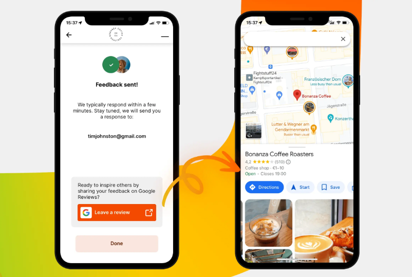
Summary: To optimize your Google Review displays for mobile visitors, consider these top tips:
- Use Responsive Widgets: Choose tools like Elfsight or Trustindex that automatically scale to fit mobile screens.
- Optimize Font Size: Ensure text is readable by setting font sizes to at least 14px.
- Limit Review Display: Show 3-5 reviews at a time to avoid clutter and enhance user experience.
- Test Across Devices: Always preview your reviews on actual devices to ensure functionality and appearance.
With over 60% of healthcare searches occurring on mobile, implementing these strategies is crucial for maintaining patient trust and improving your clinic's online presence. For comprehensive management of reviews and more, consider using SPRY, the top solution for optimizing patient engagement.
Let’s be honest, your clinic website may look amazing on a laptop. But what happens when someone pulls it up on a phone in a waiting room or during a lunch break? If your Google Review widget isn’t optimized for mobile, you’re turning potential patients away without realizing it.
More than 60% of healthcare searches happen on mobile, and that number keeps growing. Whether someone’s comparing dentists, dermatologists, or physiotherapists, their decision often comes down to what looks clean, quick, and credible, on a small screen.
And this is where most clinics drop the ball.
They embed beautiful review carousels that break, squish, or vanish entirely on mobile screens. Others load slowly, take up too much space, or look clunky. You have one chance to make a mobile-first impression, and it has to be pixel-perfect.
In this guide, I’ll break down 7 actionable tips to optimize your Google Review display for mobile users. From widget selection to real-time testing tools, we’ll cover everything you need to make your testimonials pop on every device.
Why Mobile Experience Can Make or Break Patient Trust
Let’s get one thing straight: mobile users are impatient. They’re scrolling fast, scanning quicker, and bouncing the moment something feels off.
When they hit your website and see:
- Reviews cut off mid-sentence
- The fonts are too small to read
- A giant carousel covering the whole screen
- Or worst of all, nothing loads at all
...you’ve already lost them. Even if your clinic has the best doctor in town.
Here’s Why Mobile Optimization is Critical:
- First Impressions = Everything
Visitors decide in less than 3 seconds whether to stay or bounce. - Reviews are trust-builders
On a phone, that little 5-star quote can make all the difference. - Bad UX equals doubt
Clunky widgets look unprofessional and reflect poorly on your care. - Mobile SEO counts
Google prioritizes mobile usability in its rankings.
A Google Review widget that loads beautifully, scrolls smoothly, and fits the mobile frame effortlessly sends a clear message: “We care about the details.”
And if you're that thoughtful online, you’re probably just as thoughtful in person. That’s what builds trust.
Common Mobile Display Issues and How to Fix Them
Let’s break down the usual suspects. These are the problems I see over and over again when clinics add reviews without testing for mobile:
1. Widgets Not Scaling Properly
Symptom: Review cards look squished or oversized on phones.
Fix: Use a tool that offers responsive layouts, like Elfsight or Trustindex.
2. Text Too Small to Read
Symptom: Star ratings and review content look fine on desktop but tiny on mobile.
Fix: Set your font size to 14px or more for mobile and avoid overly thin fonts.
3. Too Many Reviews in One Block
Symptom: Users scroll forever or abandon because it’s too cluttered.
Fix: Display 3–5 reviews max per section. Add pagination or scrollable carousels.
4. Unresponsive “Read More” Buttons
Symptom: Users can’t expand longer reviews, or the button overlaps with other elements.
Fix: Test functionality on multiple devices, not just emulators.
5. Widgets Not Loading on Slow Connections
Symptom: The review section takes ages, or doesn’t show at all.
Fix: Choose lightweight widgets, optimize image sizes, and lazy-load non-critical content.
Quick Fix Checklist:
- Use percentage widths instead of fixed pixel sizes
- Stick to vertical stacking rather than columns
- Set padding/margins in EM or REM units
- Preview everything on real devices (not just preview tools)
H2: Responsive Design Tips for Review Widgets

Responsive design isn’t just a buzzword; it’s a necessity. Your review widget should look good on:
- iPhones
- Androids
- Tablets
- And yes, even older phones with tiny screens
Here’s how to make sure your Google Reviews are pixel-perfect on every device.
1. Choose a Responsive Widget Tool
- Elfsight, Trustindex, and WidgetPack offer mobile-ready templates.
- Avoid iframe-based embeds unless you’re sure they scale.
2. Pick a Mobile-Friendly Layout
- Use carousels or single-column cards for mobile.
- Avoid grid layouts unless each card stacks vertically.
3. Style With Simplicity in Mind
- Keep it clean. Use one font, neutral colors, and subtle spacing.
- Avoid background images behind text—it kills readability on small screens.
4. Use “Clamp” for Font Sizes
- Advanced tip: Use clamp() CSS for fluid typography.
Example: font-size: clamp(14px, 2vw, 18px);
5. Limit Widget Height
- Set a max-height with internal scrolling, so the widget doesn’t push other content down the page.
6. Test for Tap Targets
- Buttons like “Read more” or star filters should be at least 48x48 pixels; anything smaller causes frustration.
When in doubt, start small, clean, and functional. It’s better to have a compact review section that looks great than a sprawling one that breaks.
H2: Tools to Test and Improve Mobile Display
You don’t have to guess whether your review section works on mobile; there are tools for that. Here are the best ones to ensure your review widgets are working flawlessly across all devices.
1. Google Mobile-Friendly Test
- Paste your page URL
- Get instant analysis on responsiveness
- Suggestions for mobile viewport fixes
2. BrowserStack (Paid)
- Preview your website on real devices: iPhone 12, Galaxy S22, iPad, etc.
- Great for clinics with national or multi-device audiences
🔗 BrowserStack
3. Chrome DevTools (Free)
- Open Chrome → Right Click → Inspect
- Click on the “Device Toggle” icon to simulate phones
- Test interactive behavior, touch targets, and visibility
4. Pingdom / GTmetrix
- Not just for speed—these tools show if scripts (like your widget) block loading on mobile
- Check widget load time and optimize lazy loading
5. PageSpeed Insights
- Google’s tool
- Focuses on Core Web Vitals, which matter more on mobile
- Gives a mobile score, plus review-specific warnings
Mobile vs. Desktop Layouts – What Changes and Why?
It’s tempting to build your site once, then forget about it. But here’s the reality: what works for desktop won’t always translate well to mobile, especially when it comes to displaying Google Reviews.
How Desktop and Mobile Users Interact Differently:
If you use the same layout and length for both desktop and mobile, you’re going to frustrate someone, likely your largest traffic source (mobile).
Mobile Display Tips vs. Desktop Layout Tricks:
Mobile Tips
- Use a carousel or card-style layout
- Show only 3–4 reviews with an option to expand
- Keep review length short (2–3 lines)
- Add a “Tap to Expand” function with large clickable areas
- Prioritize loading speed, compress images & lazy-load widgets
Desktop Tricks
- Go for grids or inline layouts
- Show full-length reviews in detail
- Pair reviews with trust badges or CTA buttons
- Consider side-by-side “Before and After” patient quotes
Pro Tip: Use Conditional Display Settings
Some advanced website builders (like Webflow, Elementor, or Squarespace) allow conditional visibility, meaning you can show a carousel on mobile and a grid on desktop. Use this to your advantage.
Design for how people use your site, not just what looks good on your laptop screen.
Conclusion: Optimize Every Scroll, Tap, and Star
If you’ve made it this far, you already know this: mobile users are your largest audience, and your toughest critics.
But here’s the great part: optimizing your Google Review display for mobile isn’t rocket science. It just takes a few tweaks, the right tools, and a bit of testing.
Let’s quickly recap:
Don’t assume desktop designs will work on phones
Fix common display issues before they kill trust
Use responsive, mobile-first widget tools
Test across devices and simulate real usage
Create layouts tailored for tap-and-go users
Done right, your reviews will feel like part of your clinic’s personality, professional, credible, and modern. Every tap will bring your potential patient closer to booking an appointment.
Now go out there, make every pixel count, and let your 5-star reputation do the talking—even on the smallest screens.
FAQs
Q1: What’s the best layout for mobile review displays?
A: A carousel or card-based layout is best for mobile. It scrolls smoothly and prevents overwhelming small screens.
Q2: How many reviews should I show on mobile?
A: Show 3 to 5 at a time. Mobile users scan fast—too many will cause drop-offs.
Q3: Can I show different layouts on mobile and desktop?
A: Yes! Many website builders allow conditional display rules or device-specific settings.
Q4: Do review widgets slow down mobile pages?
A: They can if not optimized. Choose lightweight widgets and lazy-load them below the fold.
Q5: How do I test mobile display without multiple phones?
A: Use tools like Google Mobile-Friendly Test, Chrome DevTools, or BrowserStack to simulate different devices easily.

Join 500+ clinics using SPRY to save time, increase revenue, and provide better patient care.
Book a DemoReduce costs and improve your reimbursement rate with a modern, all-in-one clinic management software.
Get a DemoLegal Disclosure:- Comparative information presented reflects our records as of Nov 2025. Product features, pricing, and availability for both our products and competitors' offerings may change over time. Statements about competitors are based on publicly available information, market research, and customer feedback; supporting documentation and sources are available upon request. Performance metrics and customer outcomes represent reported experiences that may vary based on facility configuration, existing workflows, staff adoption, and payer mix. We recommend conducting your own due diligence and verifying current features, pricing, and capabilities directly with each vendor when making software evaluation decisions. This content is for informational purposes only and does not constitute legal, financial, or business advice.


